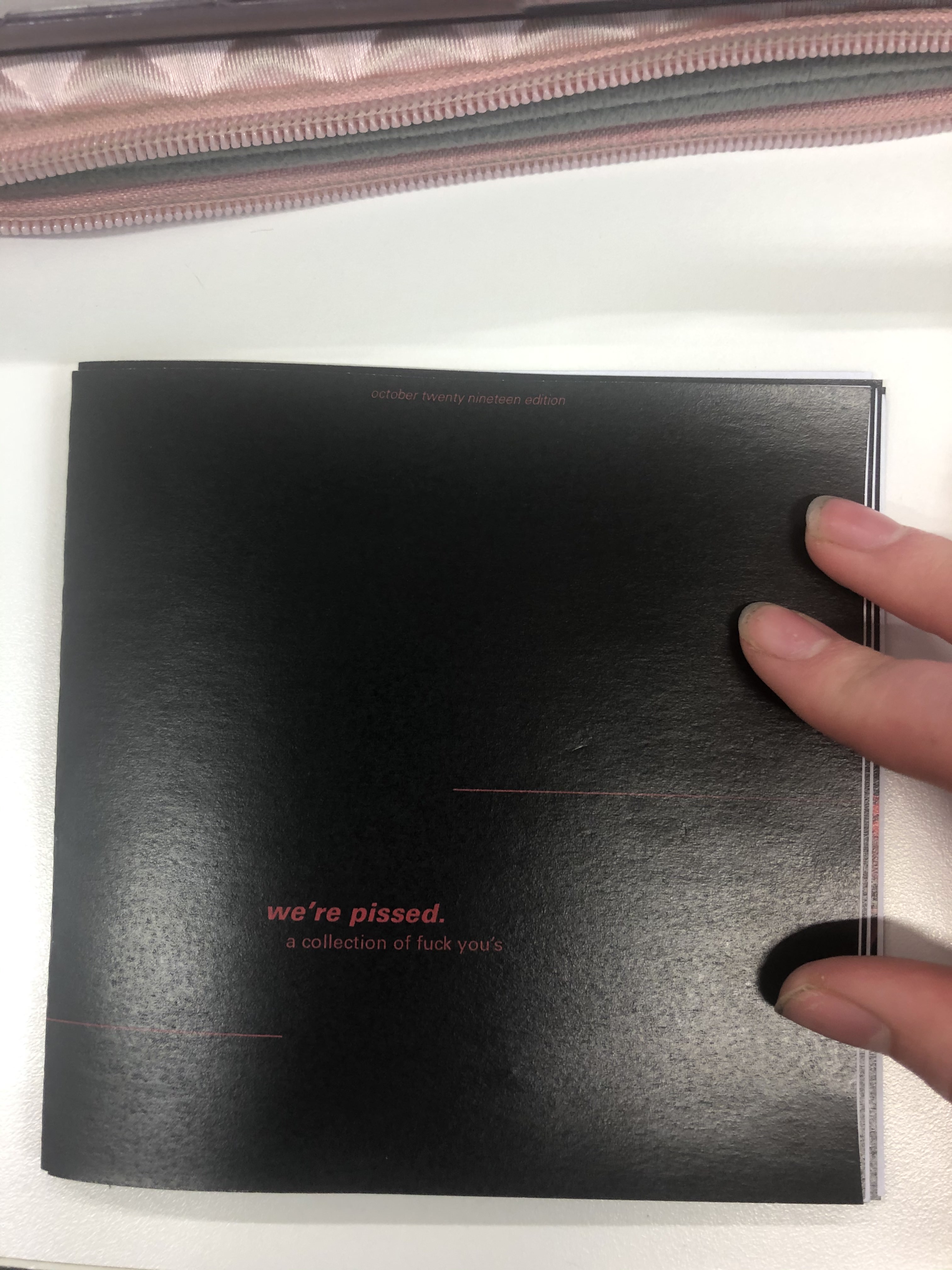
week eleven – thursday 10th october
The next mockup I intend to print will be on a thicker gsm paper and hopefully double sided for a more professional finish. This mockup was to see if the dark colour cover & pages were achievable in print, and to test if I had gotten the new booklet style text placement correct.
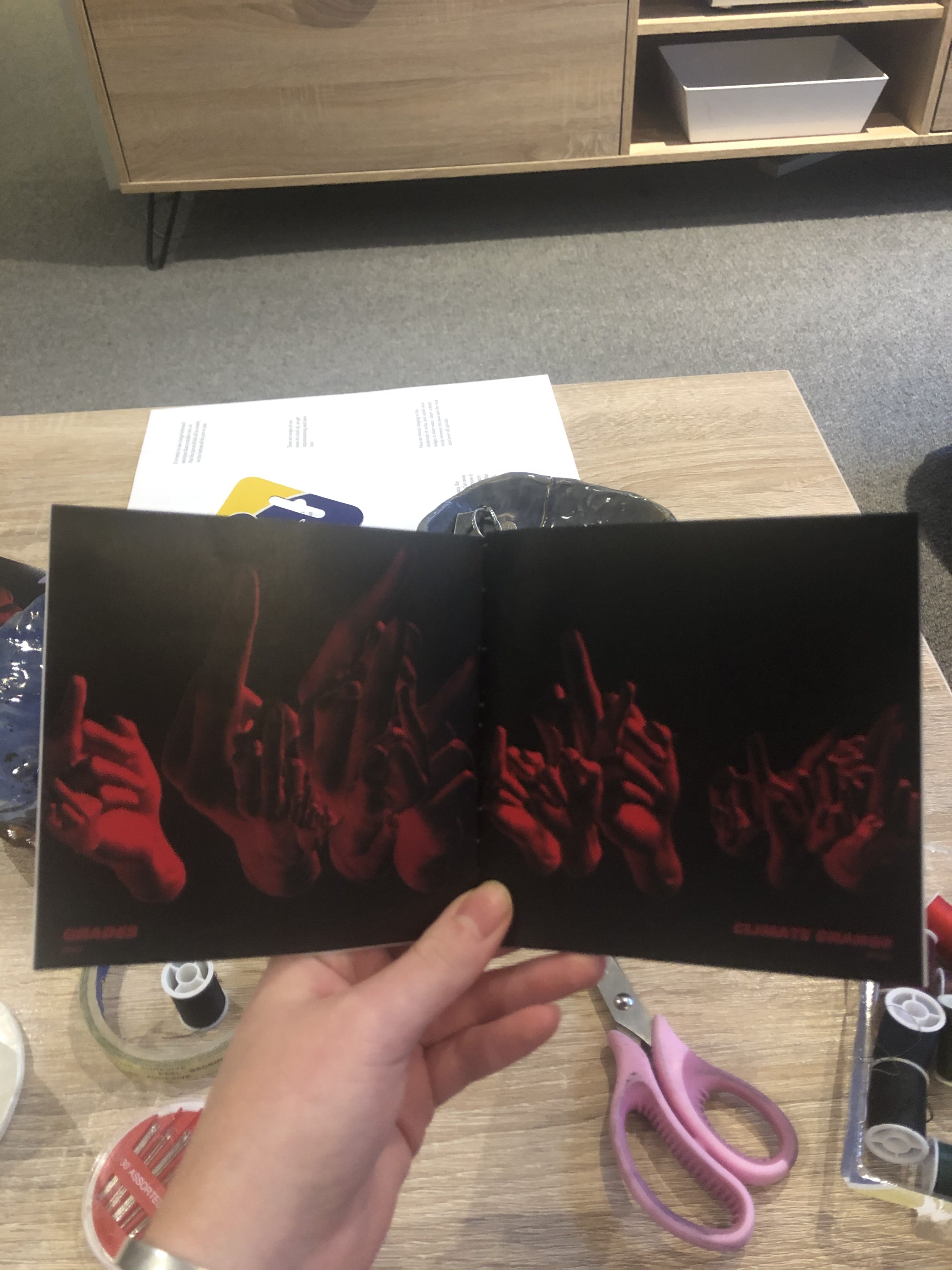
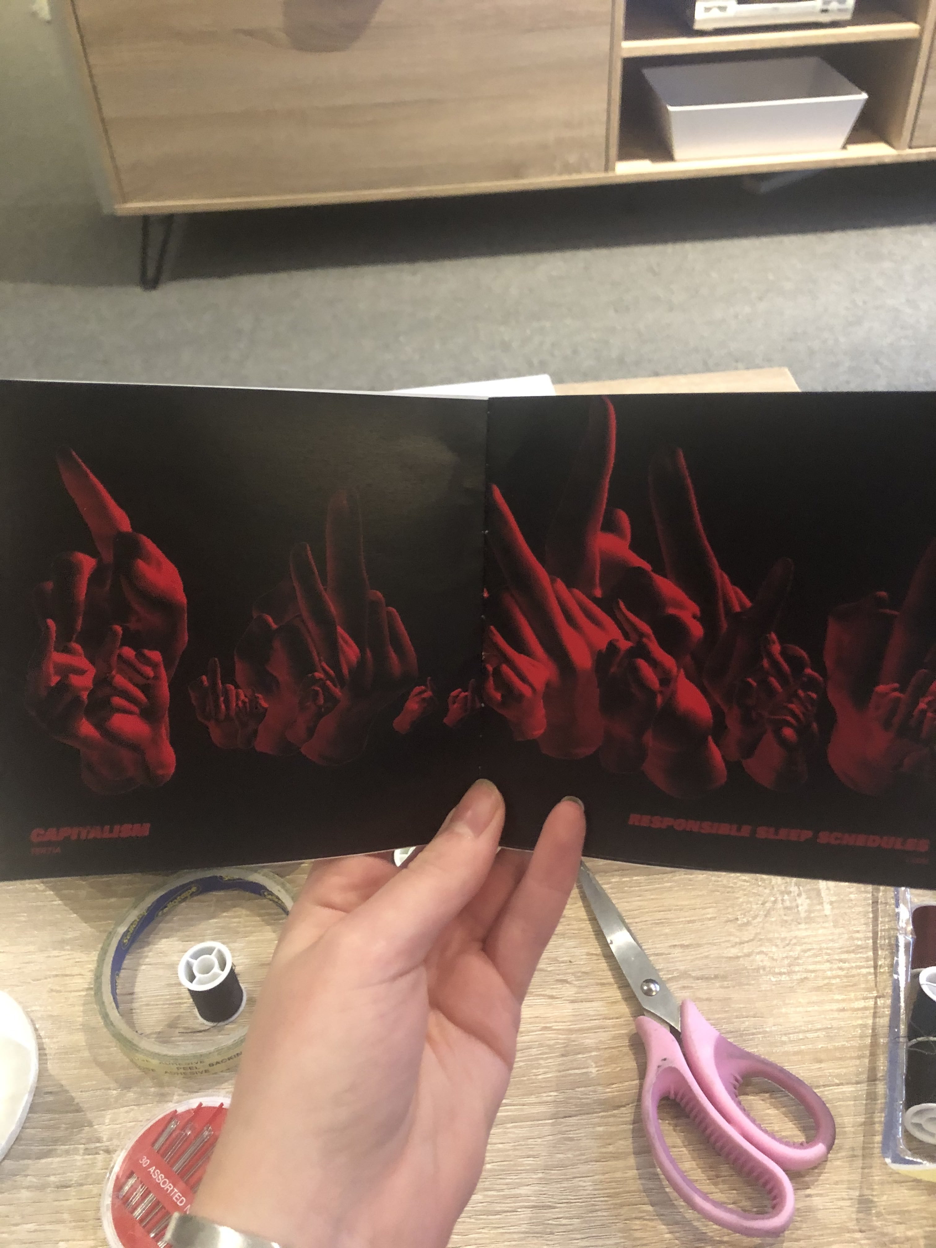
After printing this mockup I noticed that each page, when placed next to each other created a look of a double page spread. I liked this accidental development, although it needed refining. I need to develop my layout (pictured below) so that the pages that sit next to each other can flow well, either with a larger selection of hands in the middle, or more sparse. Otherwise it looks a little bit strange to go from few to many or large hands (see third slide above).


