you are about to view
assessment two
you are about to view
assessment two
week twelve – thursday 17th october
So. We are all angry. Angry at the world, at people, at systems of oppression – the list goes on. We are told we are too sensitive and that we simply need to move on.
fuck that.
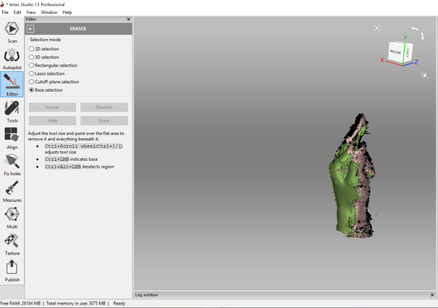
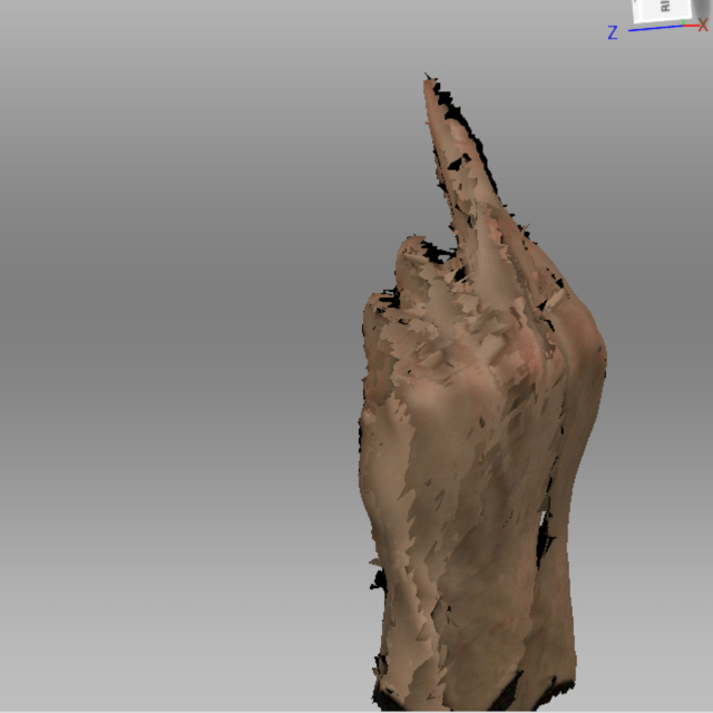
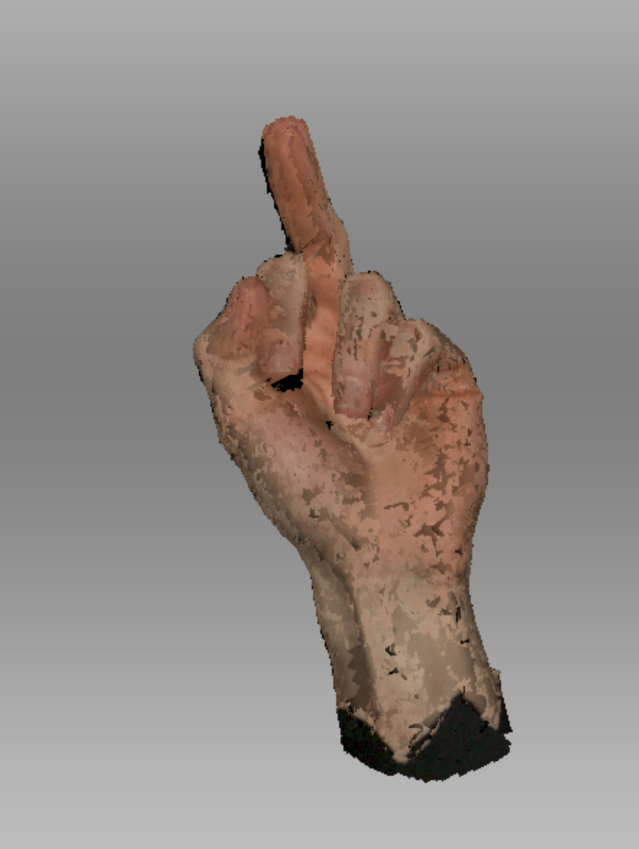
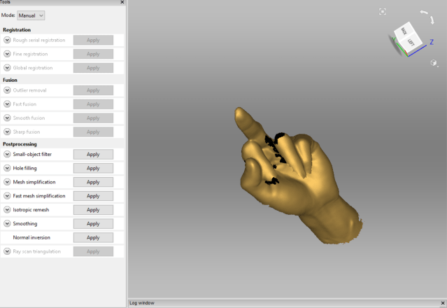
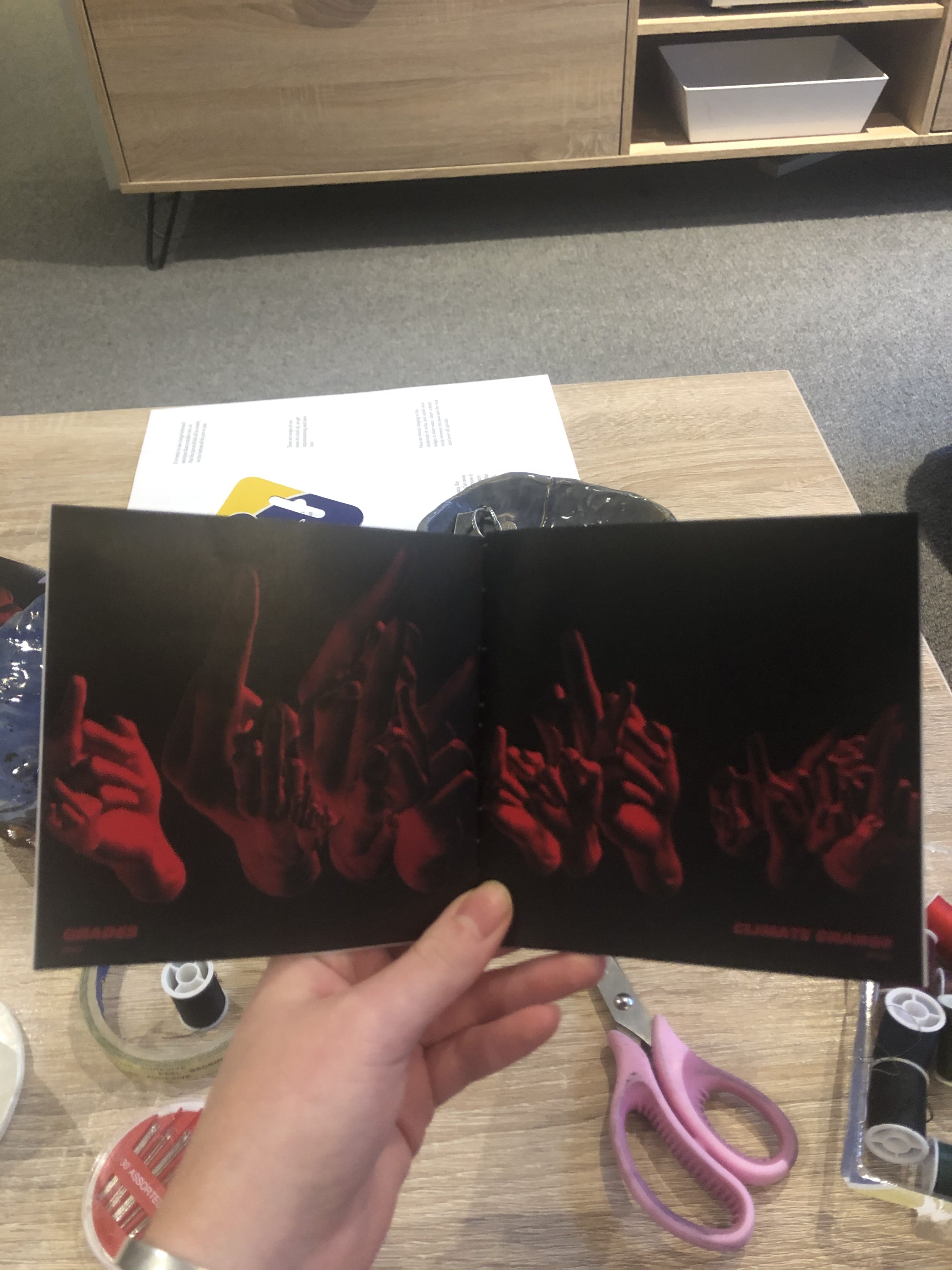
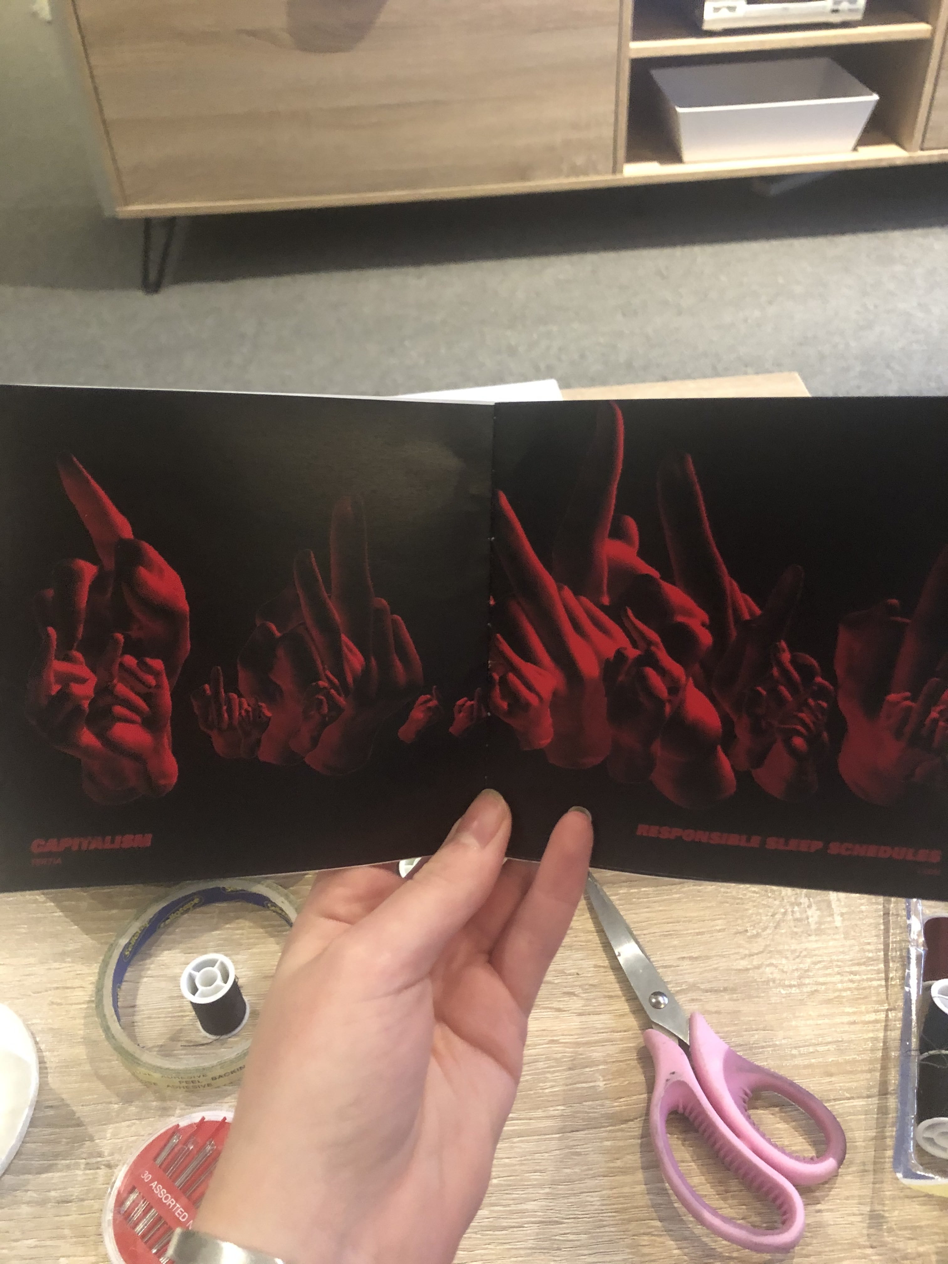
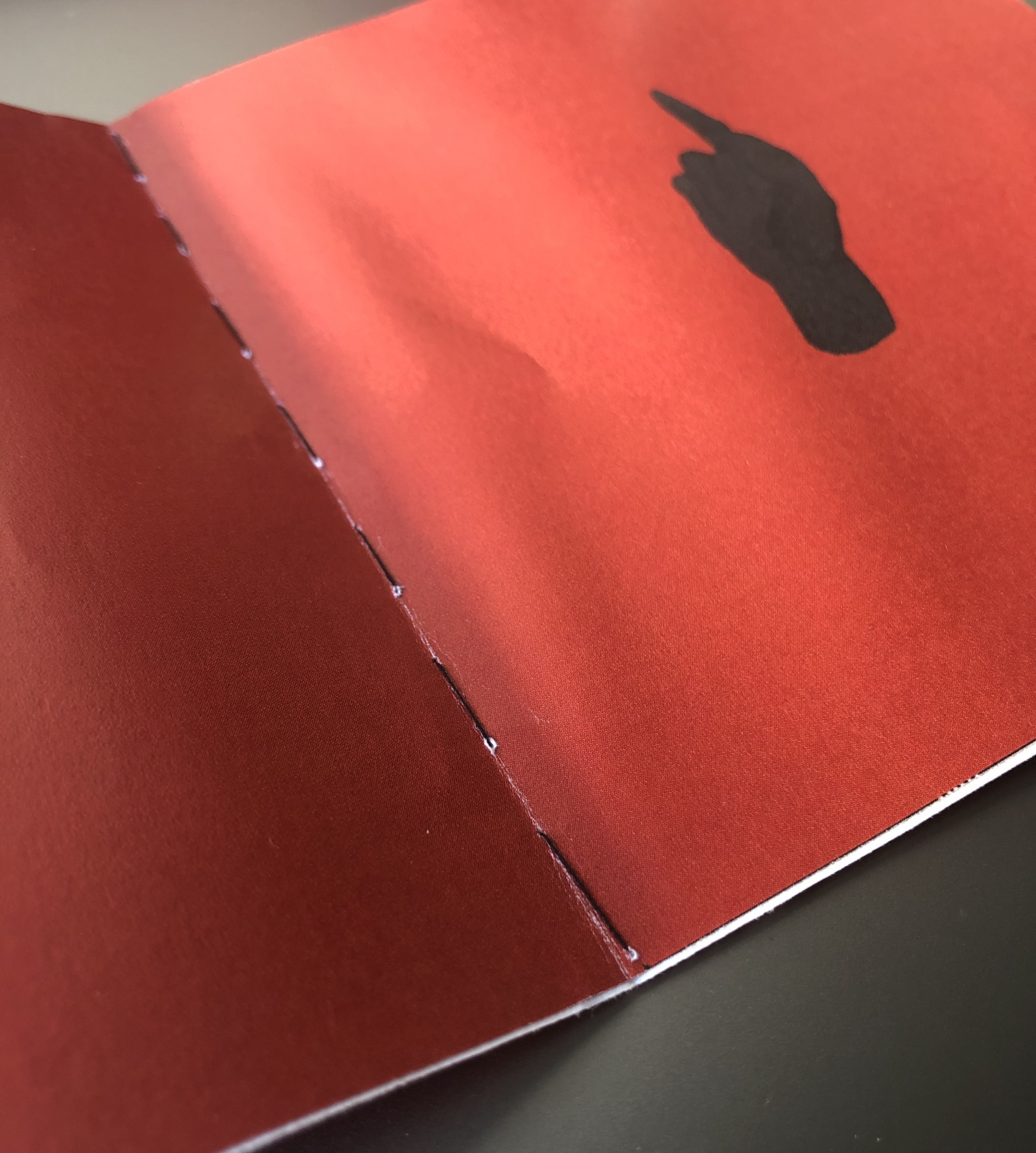
I have collected data from a handful of people around me to generate a booklet of anger. Because we deserve to say how we feel. I then took a 3D scan of a friend pulling the finger, this was to be the icon/design element of the booklet.
data
I measured the length of their middle finger and what/who they wanted to pull the finger at. This was what people said:
Caspian – 11cm – his collarbone
Harry – 11cm – chlorinated water
Liam – 11.5cm – responsible sleep schedules
Lauren – 9.6cm – animal abusers
Aidan – 11cm – climate change
Bronte – 8.6cm – trump
Ellie – 9cm – societal expectations
Becky – 9cm – her stats paper
Zeke – 11.4cm – grades
Keegan – 11.8cm – drunk drivers
Tertia – 10.4cm – capitalism
Andrew – 11cm – deforestation
Victoria – 9.5cm – brexit
Senna – 11cm – fake friends
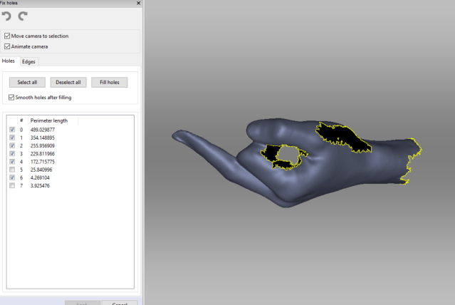
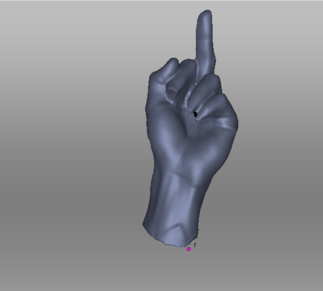
initial scan capture of hand – process of smoothing and fixing
processing
specific elements in this code that are worth taking note of include the reverting of the transform and the rotate applications to the .obj model. This enabled the hands to be drawn multiple times, where each time the transform and rotate could be reset, as to not translate further off of the last modification and therefore offscreen. (lines 64-77).
Another element is the alignment of the text arrays, rather than having them run through randomly I had to set up two seperate counters for each array and then made counter 2 = counter 1. (lines 4-7, 29-54)
Here is a video that shows off the work I did developing the lighting effects (lines 56-61)
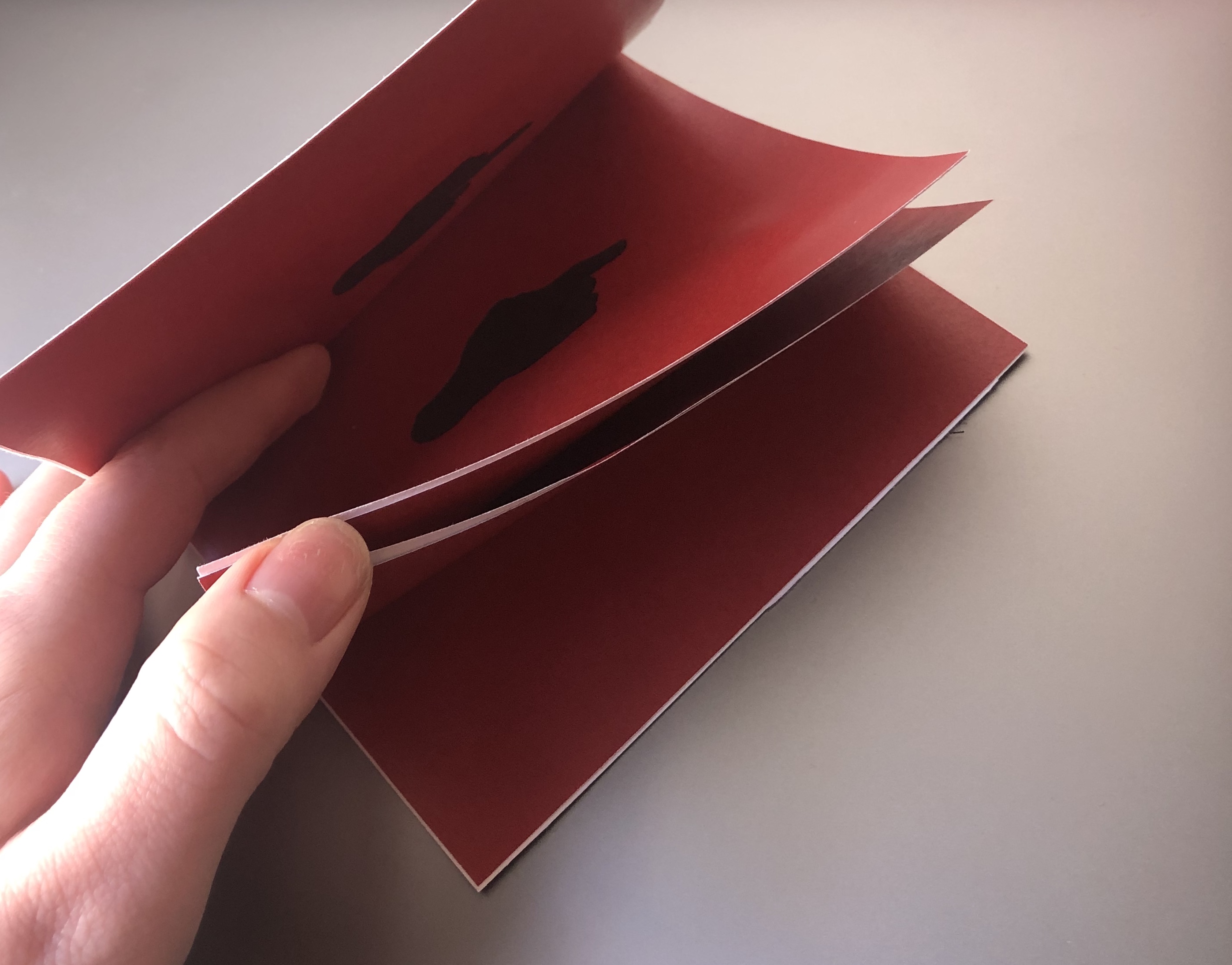
Then based on the measurement of each persons finger (rounded to the nearest cm) I ran the code that many times, generating that specific number of hands at random size, rotation and position, which I then collated into a hand-stitched booklet.
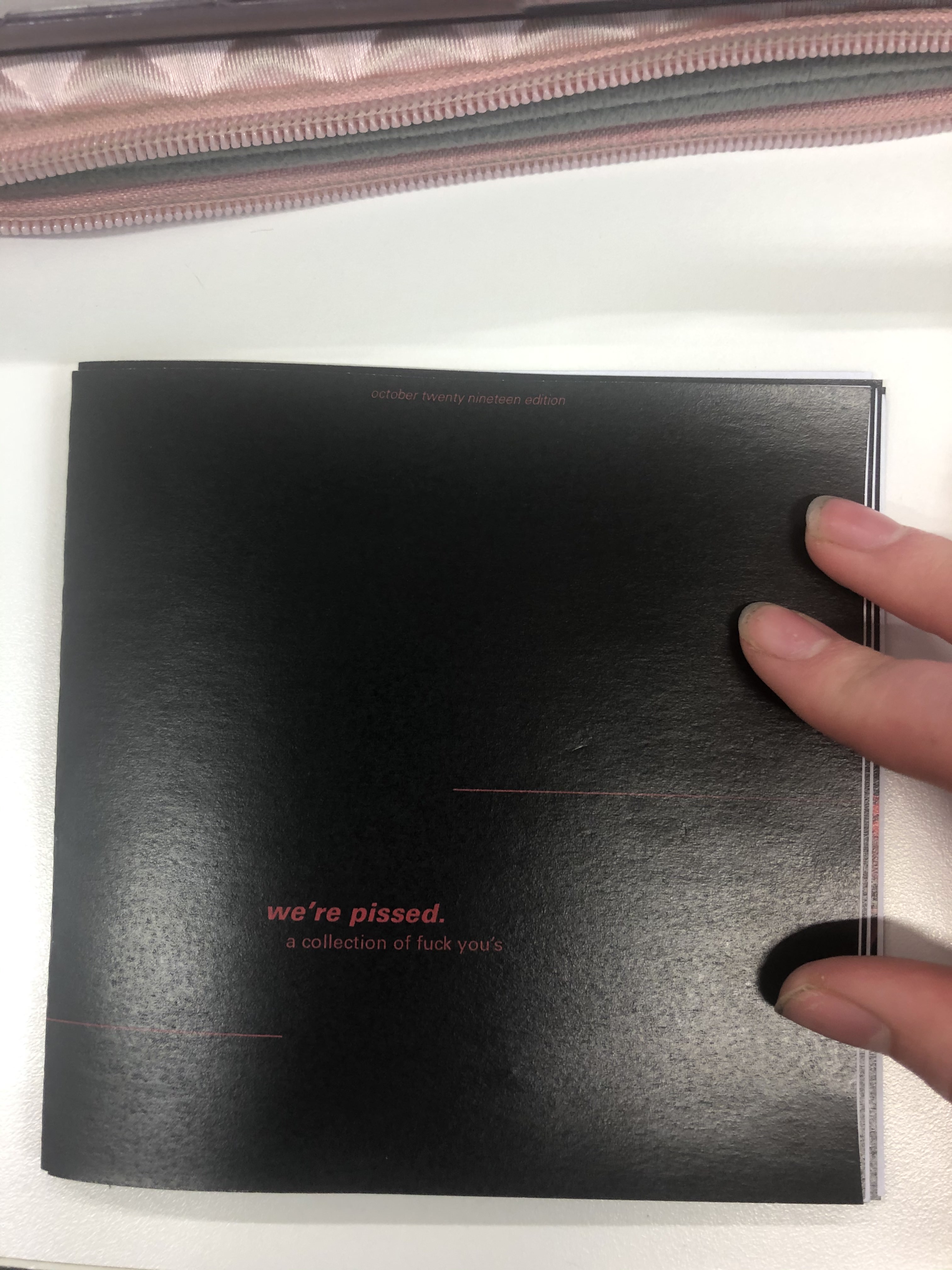
the final print
the final booklet is printed at this small hand-held size to enable it to be shared and looked through quickly as a small coffee table book to entertain and educate people.


where to next?
If I were to continue to develop and produce this booklet I think it would be beneficial to make a series, one per month or perhaps per year to reflect changing thoughts and ideas present in society. I could branch and across generations as a visual exploration as to what pisses different groups of people off. I think that this booklet works well as a small, quick flick through book rather than a longer more in-depth piece but perhaps this output has a place alongside deeper societal investigations as a visual element.
week eleven – thursday 10th october
The next mockup I intend to print will be on a thicker gsm paper and hopefully double sided for a more professional finish. This mockup was to see if the dark colour cover & pages were achievable in print, and to test if I had gotten the new booklet style text placement correct.
After printing this mockup I noticed that each page, when placed next to each other created a look of a double page spread. I liked this accidental development, although it needed refining. I need to develop my layout (pictured below) so that the pages that sit next to each other can flow well, either with a larger selection of hands in the middle, or more sparse. Otherwise it looks a little bit strange to go from few to many or large hands (see third slide above).

week eleven – thursday 10th october
design principal
The design principal that has been driving my output has been contrast. This principal was chosen as it was something that I believed would work well with the aggressive nature of my data. I have used this in my code with scale and light, and in the design of my booklet with typography.
I changed the backdrop to the red that I printed in the first mockup but this didn’t have the contrast I was aiming for. I ditched then to black, as this was something I played around with in my light testing and I thought it looked quite effective.
Next I did a quick design of the cover to print a mockup with two pages, to see if the black background would print okay, and if so what cover design could work.
It turned out that the solid red of the cover, even though it was the same RGB value dulled in comparison to the high contrast black & red.

week eleven – thursday 10th october
I took screenshots of the hand as it rotated, running the program again each screenshot to get a variety of sizes, locations and rotations. I then brought these screenshots into photoshop and used the ‘select colour’ tool to remove the white background to reveal the compilation of hands for that person.
week eleven – thursday 10th october
font and type
The next step was to set a font and align the type to create a design for the pages.
For now I have set it to fit in the bottom left of the page as a ‘title’ of the artwork with the contributors name underneath as an ‘artist’.
I also played with caps versus no caps, looking at the artist models explored in week eight. Bold statement caps are loud and obvious, the lowercase has a more fed-up, pissed off vibe.
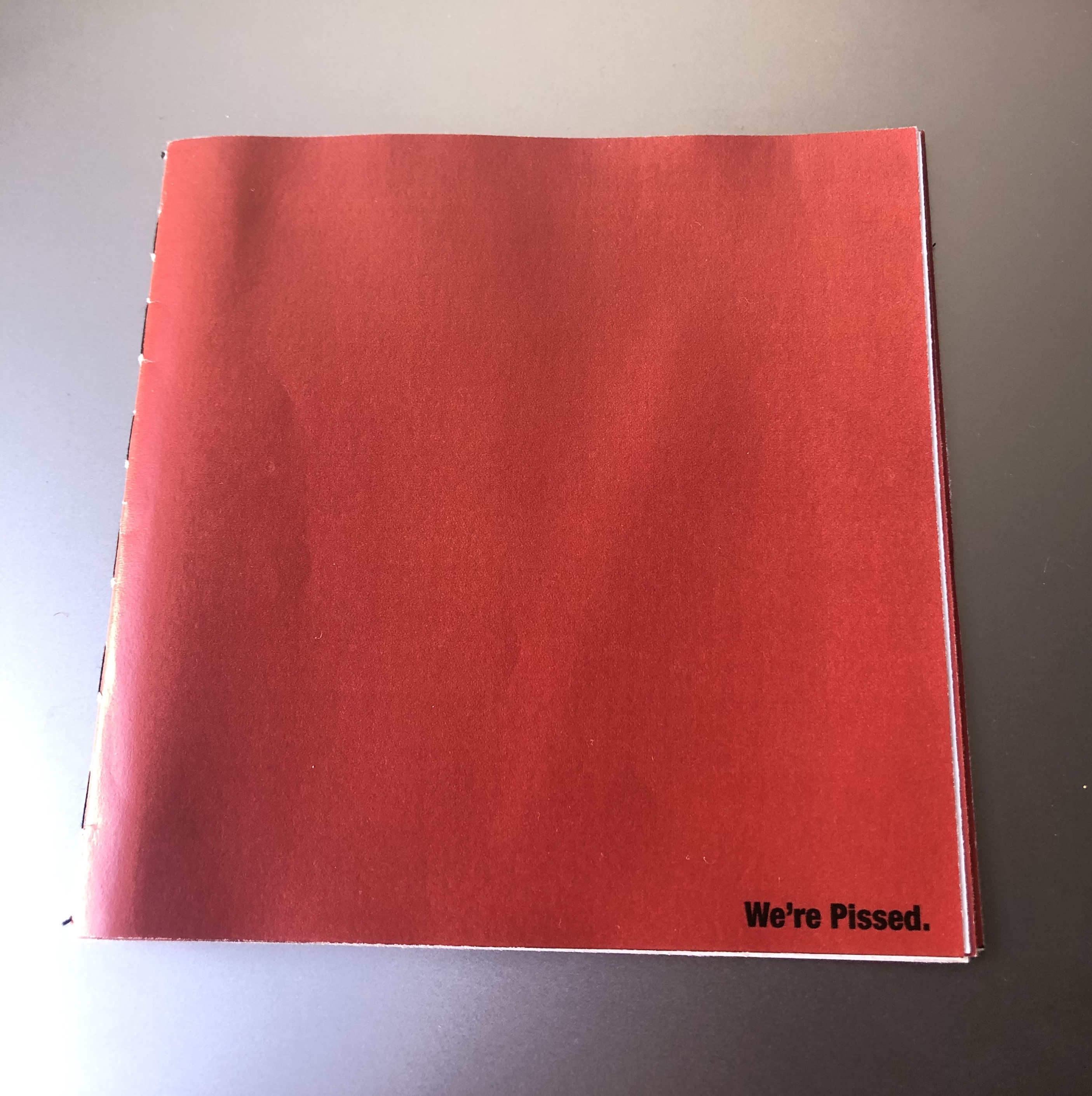
I felt that when stating the issues themselves (e.g ‘animal abusers’) there needed to be more emphasis on the significance these issues have on us. I think that I will use lowercase on the cover page to entice people in, to not make a super ‘punk/angry’ booklet that people will only pick up if they want to hear or are in the mood.
The simple ‘We’re Pissed’ on the front cover of my mockup seemed to do well as people wanted to know what ‘we’ were pissed about and why it was written/designed in such a way that was more matter-of-fact than forcing this anger down their throats.
I duplicated the PFont and text String elements of my code, swapping out the ‘angry text’ for the names of the contributors so that their names could sit with their submission. However the two arrays didn’t run at the same time, despite there being the same number of values in each array. I then sort of guessed that I needed to seperate counters for each of the seperate texts, to enable them to run through the array in the same order I simply set the value of counterTwo as that of counterOne.
So now the idea is to take a range of screenshots per statement relevant to the persons finger length and to then compile this on photoshop!
week eleven – thursday 10th october
lights function
After researching the range of lights function I brought them into a simple 3D rendered space to test. I did this rather than my hand_sketch because that takes a good while to load and test each option.
I think I will use a combination of directionLight, spotLight and PointLight to create dynamic lighting for my hands.
I then applied this to the hand model. The colours weren’t as vibrant as they were in the test, this was because the fill of the hand was grey I figured out.
The parts of the hand that aren’t lit are black still because without ambient or generic lights there is no light there.
I ended up not using spotlight as the location arguments were tricky to understand and didn’t appear to work well on this model.
I used a dark maroon directional light in the left corner and a bright red for a point light.
Here is a screen recording of the hand that I took were I increased the frame rate and set a black background – so that you could see how cool the lighting is!
week ten – thursday 3rd october
After the interim presentation I sat down with Tim to work out how to get the hand duplicating within the screen controlled by an intArray that uses the data I collected to personalise each design.
We started out slow, the first step was to simply generate two hands in one space by writing out the loadShape and relevant functions twice. Then we went to change this into an array, this had a range of errors. Pictured in the slide below is an error that shows that the [0] or first hand render width couldn’t be multiplied by two as it was technically a zero integer value. We struggled to figure out why the second hand stopped generating once we fixed the errors.
What we figured out we needed to do was revert or undo the translation after each run through of the draw function. We needed to do this because the translate function relocates the center point of an object. Without the revert, the next run through translates off of this new base again, off the screen. This also needed to happen with the rotateX function as well.
Next, in order to get the random generation of the hands across the X axis we put in translate(random(0, width));
however when we went to revert this back using the negatives values we realised that it could pick one set of random values for the translate and could select a totally different set to revert it back to.
We solved this by creating a variable that would have both random positions as the same – that we could then plug into the initial translate and then the reverted version; ‘float randomPos = random(0, width);’
this is getting a bit confusing – I hope the images help to make sense of my rambling

Another thing I wanted to randomise per page design was the scale of the hands, just to personalise the pages per render.

Then I went onto the meaty bit of my design, where I would change the number of hands in the frame based on the measurement of each persons hand. What we decided we needed to do was to change the value of hands manually rather than through an intArray because an intArray runs through the values every frame, and this was far too fast to capture/save for each ‘page’.
However the problem that we had was that when we used one of the smaller values, 10cm, the 10 3D render files took up too much memory to actually run.
One possible solution to this is to perhaps run the program and take X(finger length) amount of screenshots of the hand in random positions, rotations & scales to then composite into a whole composition in photoshop later.

The last aspect Tim and I worked on was trying to achieve the text array that is personalised per persons design.
It was important to me to use an array in my code, as this was my initial plan for generating a range of personalised design print outputs and so I wanted to at least do something along those lines.
This array was a whole lot easier than that of the PShape. I created a String array and used some of the code/skills in applying type that I learnt earlier in the semester. Tim then helped me to put in a counter that meant that the text strings would only show one per frame (rather than all at once on top of each other). Then we had to add in an if statement so that once the counter reached the eighth value [7] in the array it would reset, otherwise the counter statement becomes false and the text stops running after the last value.
So this is what we have now. My next steps to develop this is to look at how I can create interesting lighting by investigating into the lights(); function. Hopefully this will help me address some of the feedback comments I got from the presentation, in that people wanted to see more of the rotation seen on screen in the printed booklet.
I also want to develop the type into something that represents what is seen in some of my artist models work.
One thing that Tim has suggested to change is the background colour, to a more simple white so that the compositing of the design in photoshop is easier/more clean.
sorry this has been such a long post!
week ten – thursday 3 october
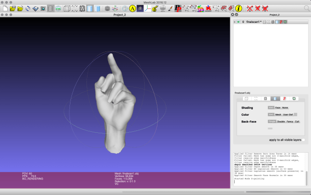
This week we have to print out a test output from our chosen media and show and get feedback on our code so far. Because the bringing in of my data into processing isn’t working yet I will just show my 3D scan and how I have done that and gotten it into processing.
Something that I need to do more research into is how to save as a PDF from processing to make the booklet pages, I tried to use the save many PDF and save complex 3D PDF options and neither quite worked!


In the end I simply took screenshots of my output and created a booklet out of that, the quality isn’t great and the printer lost some of the definition of the hand, perhaps in print I need to lighten the fill colour of the hand. One positive thing is that I practiced stitch binding on the booklet and it was quick & easy and looks good.
Overal I am not happy with where I am at and what I am presenting this week at the interim presentation. I am frustrated that the inclusion of my data is so difficult and I can’t find much online to help me here. And the quality of the booklet I am presenting isn’t that good either. Sort of worried about the PDF saver not working but hopefully this is something I can deal with later.
week eight – thursday 19 september
contextualisation of output
I have finalised my decision on my output, my data will be represented in a booklet. This is the ideal output for my data as it is easily distributed to people and is less permanent than a poster or a billboard would be – this has become important in my design as some of the data I have collected is sensitive to time and environment (e.g: Trump, Capitalism, Brexit etc) as they may not be helpful to print and display in certain locations. If for some reason the booklet is no longer an option I think I could choose a more simple application of my design as a hologram, this would enable me to focus my design on the render aspect of my code than the data & personalisation.
why a booklet over other outputs?
Looking at the nature of my data as well as my scan of Isaac’s hand I think this book is representation of anger and rebellion. These ideas have been expressed thought history in more radical and rash outputs (such as tagging, protest signage, video) than a planned & developed output that I need to make for this brief. However one example is the punk zines of the 70’s that were developed as a way to detach from publishers and labels and to genuine create a punk rock zine that was affordable for the people, made by the people. This production of Punk Zine embodied the punk ethos of anti-establishment, anti-consumerism and DIY.

These zines are a good example of what I want to achieve with my booklet as they maintain the political activism and anger within the punk scene but are also pieces of graphic design and text that can be spread and understood by the masses rather than simply seen as other outputs are.
provocative graphic design
I was in the library doing some other study for a studio paper and I came across this book about provocative graphic design, the perfect book to inform my design of the booklet!
These are some of the artists and graphic work that I thought I could act as precedents in how to think about this booklet and how each element can work together to generate a message to my audience.


Looking at these works I can see that the importance and symbolism of colour can play a big part in the way a graphic design is read. A classic colour for anger, passion and frustration, all the emotions I am trying to portray is red. Combining this with perhaps large bold black type could make the booklet loud and in tour face. However the small average font and aggressive text from the designers at Adams Morioka suggests a quite rage that can’t be underestimated, the rage of someone who is undeniably calm and perhaps tired of their situation, simply put, they are pissed-off. This is the type of anger that it looks like most of my data represents as we are struggling through an economy and climate that was destroyed before us yet we are the generations that have to deal with it and attempt to fix it.